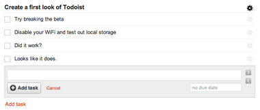
When I got the email about the new Todoist being rebuilt using HTML5 technologies, I was nothing but excited. There are some apps online that can get away with taking time and posting back to a server as well as have the possibility of the server being unreachable at times that won’t be too disrupting to a service. Task and project managers are not one of them. Let’s take a look at the new Todoist, what it has to offer, and what it feels like to use.
Speed
One of the new Todoist’s selling points is its speed. I will say it does feel like using a native app. This is done by making the interface highly responsive while doing all of the data transfer of creating, updating, and deleting data asynchronously. You don’t have to wait for data to be passed from the your web client to the Todoist server and vice versa. Moving, creating, updating, and deleting tasks is simple and works well. Even all of the searching and sorting is done client side making filtering of your lists and tasks nice and fast.
Local storage
Another killer feature of the new Todoist is its use of HTML5’s local storage API. This allows the app to go offline if the Todoist server isn’t available and use local storage to create and modify your data. When the server comes back, all of your data is pushed back to the cloud and synced up. Like I said in the intro, this is an excellent feature for a task and project management application because of the nature of its use. People tend to use their project management application day-in and day-out, so having it available at any time, regardless if a server is up is crucial.
The use of the local storage API is fantastic and will be a precedent setter for any other web based task and project management apps in the future.
Mobile
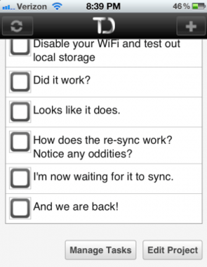
Another key feature of the new Todoist is its mobile support. The ideas is to have one app that supports a desktop browser as well as a mobile browser to ensure that your todos are available anywhere, anytime.
Another issue that I had with the mobile app is its use of non-retina graphics for the refresh and add task buttons as well as the Todoist logo itself. It’s a small detail, but something that takes away from the user experience. The beta of the new Todoist shows us that you can now have a decently complicated webapp feel like a desktop app with the use of HTML5 and JavaScript in the browser. The app is fast and fluid and truly does feel like a desktop app when in use. Despite the few bugs I ran into (it’s a beta, remember), I’d have to say that the new Todoist is going to be one of the best web based productivity apps that will be available. It will be interesting to see what other apps like Toodledo, Remember the Milk, etc. do in response to this dynamic change of Todoist. Check out the new Todoist for yourself and let us know what you think in the comments.


